Introduction
In the 1600s, clay sculptures were painted on large canvases as advertising for businesses. The best artists today create animations using digital media.
What has changed since the last time you visited?
The medium has evolved. The art is still there.
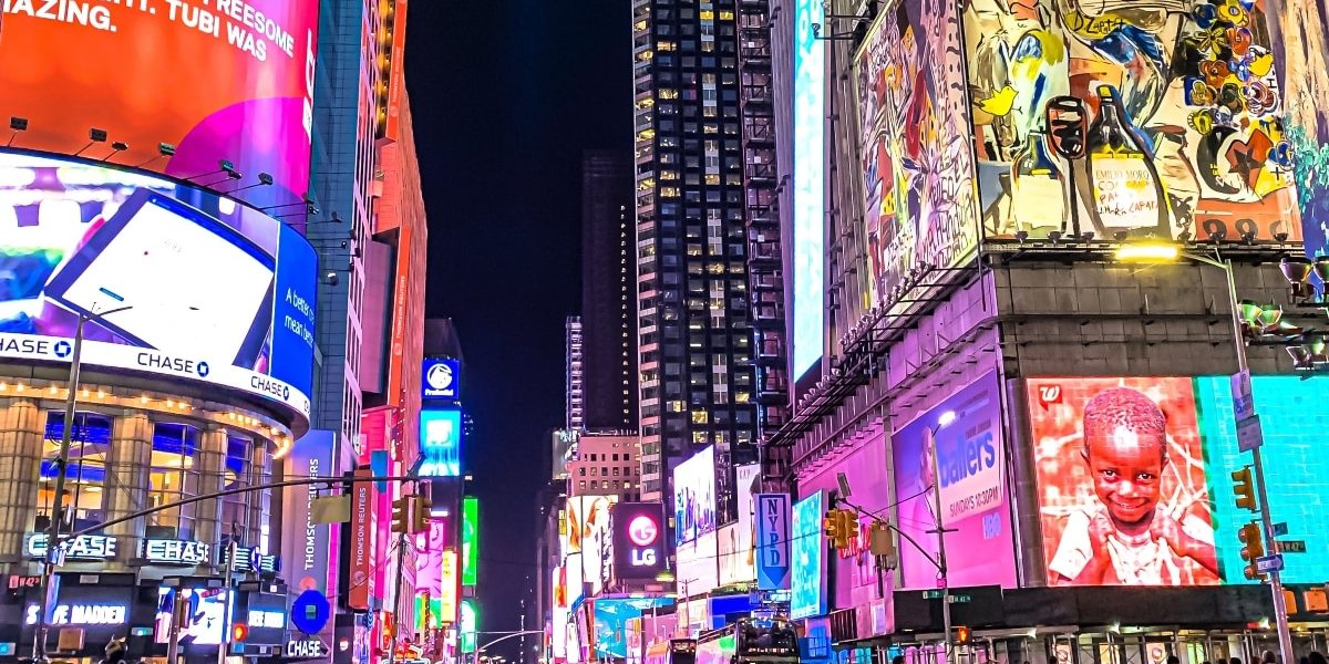
Digital signage is a medium that’s constantly evolving, combining the best of old and new. The concept of a signage is not new, but the digital platform for communication is. The criteria for creating digital signage content is now at a new level. This article will cover the importance of effective content creation, as well as some tips for creating content for LED signs and common digital signage mistakes.
Create Effective Content
Imagine that your content is the foundation of your digital strategy. You will find it difficult to convert leads into paying customers without clever content. There are four reasons why great content is essential to digital marketing success.
- Your audience makes better decisions because they are more informed. They should know all the options available to them before making a decision. You can only do this if you provide the right content to educate your audience about your products/services.
- Digital signage content allows you to optimize your products so that they appear in relevant searches, and attract new leads to your site. Strong content is crucial to boosting content for Search Engine Optimization.
- Share your content on social media to connect with the audience you want. It is an effective way to establish genuine relationships with customers, as there are direct pathways for one-on-one conversations, feedback and the possibility of new leads on your website. This is only possible if you have strong content.
- A great content can also be used to generate backlinks to your website from other websites, increasing traffic. This strategy only works if your content is high-quality, contains ideas, opinions, and other important information.
Create effective content with these tips
1. Technical details are important
Be sure to consider certain information before you begin creating your content. These include the minimum viewing distance, resolution, pixel pitch and environment. You need to be aware of everything that could affect the visual impact your digital signage content will have on its viewers.
Each digital display is different, and what works on one screen may not work on another. When deciding on the pixel and resolution for your content, it is not recommended to use automatic scaling. It is best to create content with the exact pixel-resolution of the LED display for maximum viewing quality.
2. Stick to design principles
Contrast is the most important factor for legibility. Avoid overwhelming your audience by using bright, contrasting colors when choosing color contrasts. Simple color contrasts are the key to a design that stands out. Colors for the foreground or background should be very contrasty, especially if there is a large amount of text. The message may be lost if viewers are unable to distinguish the different elements in your design.
Red, green, and blue (also called RGB) are the three colors used to create all other colors in the digital world. Black is the absence or lack of RGB. White is a mixture of all three. Green is the most visible color to the human eye, followed by red and then blue. Remember the rule of thumb when choosing color contrasts: Light on Dark or Dark on Light.
Avoid using white or red for the full screen background. This can cause your LED sign to last less, use more electricity, and be distracting to your audience. Backgrounds should be dark and soft. As an example, you can use black on yellow or yellow on black.
3. You can also download the format of your choice
We offers endless marketing possibilities – videos, images and animations, text, 3D graphics, etc. It may seem tempting to have every corner of your display animated, but DON’T. Too much animation can distract the audience from your message. They may not read the important messages but instead focus on the video or animation being played. It is therefore recommended that motion tools are used sparingly to avoid disrupting the readability.
Here are some tips to create visual interest using motion and animation without being distracting:
- Slow pan of a static image
- The steady shot of a moving object
- Time laps in a cityscape
- Fade-in and fade-out transitions are used to switch between images.
Focus techniques, such as bright colors and graphics, will help you to direct the eye first towards important information. Then, create a hierarchy of visuals in your design. You can highlight different elements by playing with the sizes, angles, and spaces of your arrangement.
What is the best way to pace your content? You can determine this by answering: Is your digital sign at a Point of Transit or Point of Sale?
- Point of transit is a place where people are constantly on the move. These include large digital highway billboards and wayfinding kiosks. You have a very short time to grab the attention of your viewers, so you need to be as bold and concise as possible. Why? The dwell time is only about 2 seconds. This is not enough to make an impact.
- Your audience will be at the point of sale if they are not in a rush but still have a reason for being there. Your content should be focused on the immediate opportunities available. You can use a promotion or giveaway on the adjacent aisle.
- You must also consider the length of time your audience is likely to spend in visual range of signs. Then you can decide how frequently to change between segments. Do not bore your audience by showing the same content on screen all the time.
A digital sign advertisement should be timed to an average of 6-10 seconds. Slides should be created with an average duration of 3 seconds. Any less than 3 seconds is not enough to convey a message, and any more will bore your audience.
4. Text and Font Selection
The words on the screen have a purpose: to communicate a clear, concise message. Here, the general rule is: Less can be more! Text should not be over-used in your final output. Display only the most essential information. Limit your message to no more than five words per line on three lines or three words per line on five lines. Font sizes should be large to allow for easy reading from a distance. Consider where your audience is going to stand and what they are going to do with the screen. A font size of one inch is more readable at a distance between 20-25 feet.
It is important to choose a font that is easy to read. Use no more than two different font styles in a single design and avoid using italics to overwhelm your message. Serif fonts help the eye to keep track of words in long texts. Arial, also known as sans-serif fonts, is a font without serifs that is better for reading short messages.
5. The Message
Don’t waste the opportunity to grab viewer attention.
Display content relevant to your target audience, and that aligns with your marketing campaign. Don’t bore your audience or waste their time by showing them irrelevant information. Use strong verbs, particularly those that motivate potential customers to act. Tell them where to go for a specific product, such as a store address or website. Give dates if you’re advertising a limited time promotion, for example. This will create an urgency.
6. Testing
As you preview your final look, pay attention to where your eyes go first. Make adjustments to your design so that the most important elements stand out. Check the readability from an observer’s point of view, check your media quality, and consider other technicalities like brightness, colors, visibility etc. Stand five feet from your screen to stimulate your audience’s perception of your advertisement. After your campaign has been implemented, you should go to the location and check out the results. It is important to inspect your digital signage and correct any problems that you notice.
Digital signage mistakes to avoid
- Color contrasts are poor, such as white text on a yellow background.
- Images with poor resolution floating on a white background.
- The floating elements of text, images and animations without any apparent sense of composition.
- The same content is displayed on the screen for several weeks or months.
- Long sentences and lengthy text
- The slide is moving too quickly.
- Too long holding on to the slides.
- Text, images and video overlapping.
Conclusion
The effectiveness of digital signage is determined by the content. It can be difficult for a non-designer to create content, but budgetary constraints may force you to do so. Don’t worry, if you follow these tips it’s possible to create visually appealing and engaging material for your audience.