Signage can be a powerful tool to deliver key messages, grab your customers’ attention, and inspire them to act. This could include shopping at your clothing store during a big sale, or attending an event in your restaurant.
Signs are not created equally. The impact of your sign will be determined by how well you design it. Follow these three tips to help you create signs which will make an impression on your customers and help you achieve your business goals.
- Signs that use contrast will stand out.
- Hierarchy tells people which books to read first.
- Readability ensures that people can understand what they are reading.
1. Signs that use contrast will stand out.
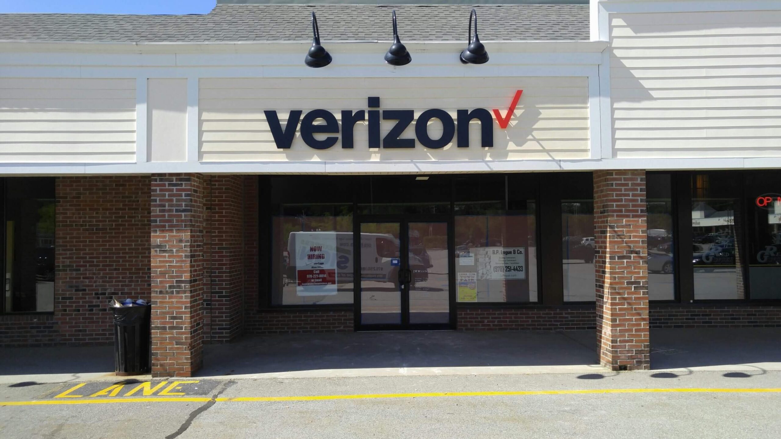
Tristan says that creating contrast will help people read your sign more quickly. Avoid using complementary colors or similar ones, like orange text on a background of red. Pair colors that will stand out from each other, like red text on white background.
High-contrast designs are great for readability, as they ensure that your message stands out (literally). A dark background with a lighter color text is the most effective way to create contrast.
If, for example, your sign design includes white text on a black backdrop, the text will “pop”, making it easier to read. If your sign design features navy blue text on a black backdrop, it will not stand out, and your customers will need to strain their eyes to read it. If they don’t understand what you’re saying, they will probably walk away. Your message may get lost.
Color combinations that create contrast can be used in signage designs.
- Black and white
- Black and yellow
- Blue/navy/white
- Green and white
Play around with different elements in order to add contrast and draw attention to certain parts of your sign. If you are creating a banner for an upcoming promotion, you may choose a dark background with light text, but add a square with a lighter background and darker text to draw attention to one part of the message (like 50% off).
By pairing dark and light colors, you will not only attract your customers’ interest but also make it easier for them to read the message on your sign.
2. Hierarchy tells people which books to read first.
You need your customers to be able read the sign. How they read your sign is equally important. Hierarchy plays a role in this.
Design hierarchy is the use of size and scale in order to communicate importance. You can use hierarchy in signage design to tell your customers which information to read first and to emphasize the most important details.
Text size can be used to create visual hierarchy. The biggest type will grab your attention right away, so the most important message should be in the largest font size. You can then use smaller fonts to convey less-important details.
It is important to consider how and where you present your text. People read in many languages from top to left and bottom to top. So, the most important (and largest) text should be placed at the top. It is important to place the largest text at the top, and then work your way down.
Let’s say, for example, you want to design a posters in order to promote the new lunch special at your restaurant. You could put “Lunch special” in large font at the top of your page. Then, in a smaller typeface, you can list the details about the lunch special. Finally, the contact information for your restaurant is located towards the bottom.
Bottom line? Visual hierarchy is a key factor in grabbing attention. The larger and more prominent the element, the better.
3. Readability ensures that people can understand what they are reading.
In order for your signage to be effective, it is important that customers can read the exact message on your sign. While contrast and hierarchy are important factors in allowing your customers to read your signs, there are also other elements.
What are these elements, then? Design elements can make a big difference in the readability of your sign (and therefore, its effectiveness).
- Font. Few design elements are as important as fonts. Tristan says that the fonts you choose can make or ruin a sign. Some fonts are more readable than others; for example, a simple sans serif font (like Arial) is going to be easier to read than a more complex script or brush font (like Pinyon Script)–particularly if your customers’ are looking at your sign from a distance. Stick to simple fonts if you want your sign to be as readable as possible. If you choose a brush or script font, you should make the text larger.
- There is no need to cram every inch of your sign, banner or poster with information. Trying to jam too much information into your signage can make it visually overwhelming, making it difficult for your customers. Instead, embrace the space in your design. Tristan advises: “Crowded signage is harder to read so don’t fear ‘negative’ or white’ space.” White space should cover 30 to 40% of the surface area of your sign to make sure important elements such as your message and logo are clearly visible.
- Use all caps to draw attention to specific words or phrases in your signage design. But if you overuse it, ALL CAPS CAN ACTUALLY MAKE YOUR SIGN HARDER TO READ. See what we did?
- Letter Height. Your sign’s readability will depend on the height of the letters. The taller your letters are, the easier it will be for your customers to read your sign from afar. This chart gives you an idea of how tall your letters should be depending on the distance your customers are from your sign.
Signage design ideas that will help you get the most from your sign
Want to know more about how to create the most effective sign? Here are some tips to remember during the design phase:
- Color can inspire action. It is powerful. Tristan says that colors have psychological, cultural and emotional connotations which can influence purchasing decisions and consumer behavior. If you want to make your signage effective, what should you do? Take advantage of these connotations. If you want to create excitement for a sale coming up, use red as a design element. It is associated with energy. Use blue to create a sign that inspires trust among your customers. Blue is often associated with reliability and trustworthiness.
- Consider where you will place your sign. Let the final result drive your design choices. Tristan says that it’s important to understand how and where the sign will be seen. Will it be seen from passers-by on foot, or from the car window? It will it compete for attention at a busy shopping mall or hang on a quiet high street? These answers will allow you to choose the size, shape and style that is most effective and appropriate.”
- Signage can be used to reinforce your brand. You should use signage to enhance your brand’s image with customers. Tristan says that your sign should match the other elements of your brand, including your logo, fonts and colors, as well as your tone of voice. While you want the sign to stand out, it should still be an extension to your brand. This consistency makes you recognizable, and gives your audience a feeling of reliability and trust.
- Be creative with your sign ideas. Be creative! Create an impactful design and find new ways to communicate your message. The more creative, new, and innovative your design is, the better it will grab the attention of your customers and drive sales.